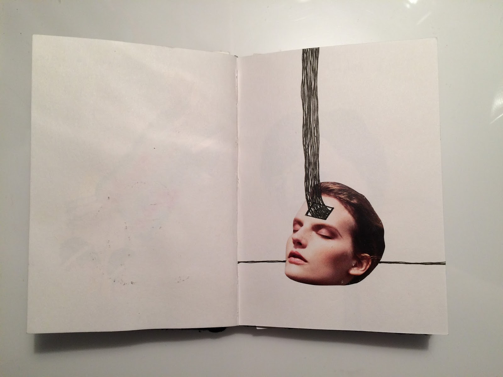
Taking a look at artist websites and general online presence...
Seeing the difference between Tim Marrs’ first and second
website, I can see how important it is to know exactly how you want to come
across to people. I also think that as appearance is a very personal thing and
very important for artists, it is probably best done by the artist themselves,
such as Tim Marrs has done the second time around and with companies such as
Squarespace, there’s no reason why it can’t be as effective as paying someone
to build your website for you. Marrs’ old website had a black background with a tiled
gallery format. The combination of the black background with the multiple, high
contrast, busy images over the top made it very uneasy to focus on any
particular image. Initially my thought was ‘maybe just having one image on
screen at a time, on a white background would make this website better’.
However seeing the new website with a white background still with the tiled
gallery format, I can see that the white breaks up the images enough that I am
not distracted and can focus on each individual image. This to me shows how
important it is to think through every aspect of your online appearance. I also like a feature he has used where hovering over each image tells you a bit more about the picture so you don't have to click on every image to find out more about it. As branding, Tim uses a logo which appears on his website, twitter,
business card etc.


Scott Garrett’s website is a true reflection of the
personality of his work. The handwritten title reflects the friendly nature of
his illustrations. Garrett uses cute names to differentiate between his pages:
GarrettWorld is his website, GarrettWare the pottery shop, GarrettWear the
t-shirt shop and GarrettLife his blog title. Gary Neill’s website is also a
reflection of the way in which he works. The website is clear, simple and very
professional looking, using an existing font as the title. Each page title is
straight forward and links to social media are instantly visible. The tagline used in the title 'strong simple ideas' lets you know what kind of illustrator he is, from this you would assume his work is conceptual and bold, which it is. Putting myself in the position of a journalist, I could write an article, come to this website, see a flash of images getting a clear idea of the style, see the tagline and see the phone number all within seconds of entering the website.


Martin O’Neill
chose to call his website ‘cut it out’ rather than his actual name (which is
present on the homepage of his website). I wouldn't say this is better or worse
than using your name as your title, it does make it memorable as it’s a play on
phrase being appropriated to his use of collage. Then again, using your name
makes it more direct and possibly easier to find you when someone searches for
you. I like the icons on Martin’s website, each title has a cut out image loosely
appropriate to the page and when you hover on them the real thing appears. To
me this website shows time, thought and perfectionism; it’s easy to navigate,
fun and memorable and all necessary information is given clearly.

Mick Marston’s
website ‘The futile vignette’ is completely different to all of the above. The
homepage I find slightly overwhelming as it’s a tiled gallery of illustrations,
all of which are very bold and bright similar to Tim Marrs’ first website. As
you hover over certain images, bits of text (which is slightly difficult to
read) appear and all contact information is at the bottom of the page, which
takes a while to scroll down to.